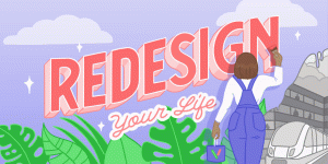
Ch-ch-changes… Why we rebranded to a SaaS design agency
Announcement • August 2, 2022
When we work for our clients in any capacity we are always talking about the brand – it impacts everything we do – not just visually, but for companies who put their brand values at the heart of their decision making process, it guides them from the tone of their marketing copy to the features they develop for their product.
Their visual identity is the visual expression of their brand, the values, personality, mission and more – it enables them to connect with their target audience and convey the essence of who they are.
As a design agency we wanted to practice what we preach and felt the time was right to refine our proposition and redesign our visual identity to reflect it.
For the gory details of why and what we changed please read on.
Why
The biggest reason for our brand change was the honing of our proposition: We are now a specialist SaaS (digital product or service) design agency focussing on retention – designing the complete digital experience from brand to marketing to product with the purpose of getting our client’s customers to stay for longer and ultimately driving up their lifetime value (LTV).
Audience
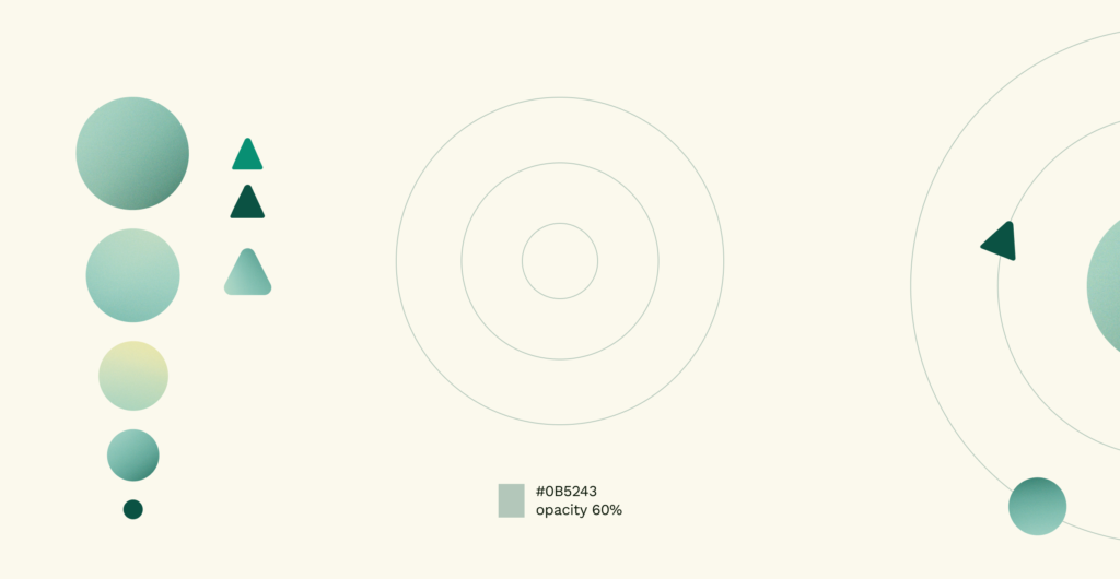
Our proposition as a SaaS specialist design agency focussing on LTV and not just awareness and acquisition was the inspiration behind the ‘Orbit design system’. As a SaaS provider you need to ensure your customers stay for as long as possible in your orbit by providing a great product but also through a fantastic customer experience (CX) and user experience (UX) for your product.
Your customers are human beings that want to stay with you but will need a compelling reason to do so – a great product is essential but your brand gives you the tools to communicate your proposition and the marketing site is the primary platform to do that. All 3 need great design to connect with your target audience and that’s our speciality – building lasting connections with your precious customers.
We understand the value of specialists and work with a great team of partners to help deliver the projects we undertake. Our own rebrand was no different as we needed help developing our proposition and it came in the form of Treacle – a specialist brand and copy agency for agencies. They put us through our paces to tease out the brand attributes and the overall message hierarchy through a series of structured workshops (and some heated debates!).
Other reasons for the change:
We’ve grown up!
At the grand old age of 3 we felt as much as we loved the people illustrations and bright pinks and greens, they weren’t quite the right for where we were as a company
Reflect the complexity of what we do
We don’t just do one thing. Sometimes we wish we did but the fields of UX and UI have grown to encompass a wide range of skills from user research to creating design guidelines and now that we’ve added website build as a service (and the array of skills that requires) we needed to reflect that in our visual identity.
Website update
Our primary sales tool needed an update from the ground up. Over 3 years old and having been tweaked and changed for various ‘design refreshes’ it was creaking quite badly and needed a rebuild. Whilst this wasn’t the key driver it helped justify the complete overhaul.
What
Logo
The original logo was inspired by the pictograms of Otl Aicher with the 2 parts of the ‘V’ representing the ‘direction’ and ‘magnitude’ of the physics mean of the word Vector. We felt we wanted to show a more mature version of ourselves with the new logo, reflecting the development of our project processes and thinking. We’ve still hinted at the ‘direction’ with the subtle arrows in the t and v and in spelling out the full name we hope to answer the most common question asked when people used to see the V: what we’re actually called!
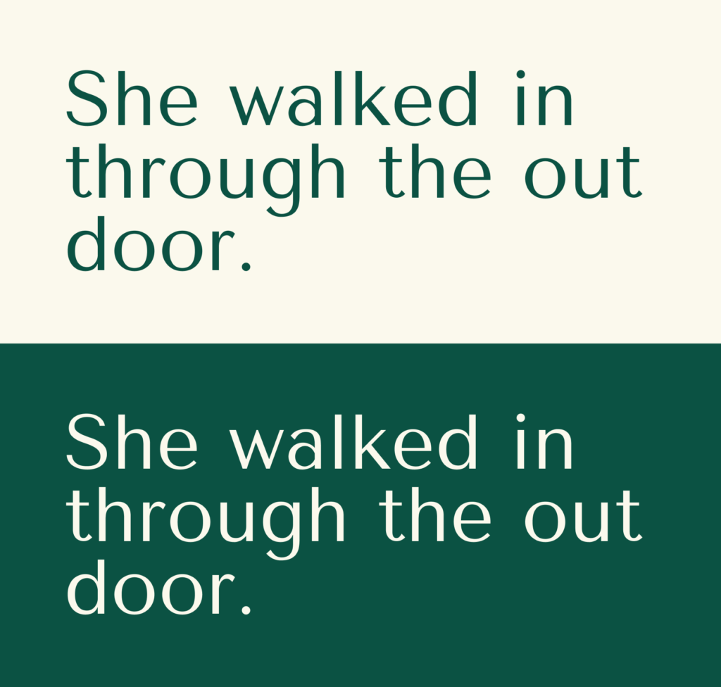
Typeface
A lot of design decisions are made from a gut instinct. You can search for a typeface for days trying to make it fit a target audience profile or a brand personality trait but sometimes you have to trust your instincts about what simply looks great. Tenor Sans was that typeface for us – different enough from what we had now, stylish but with enough character and versatility for it to fit the range of use cases.
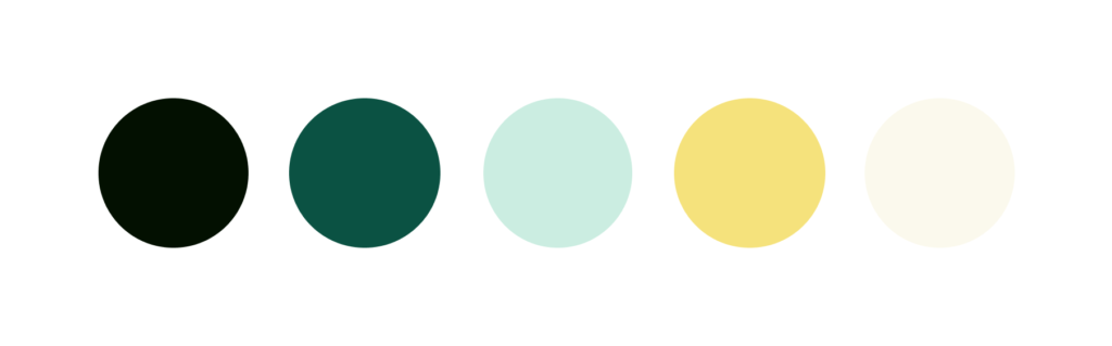
Colour
Finding differentiation is key in a crowded market so we created a matrix of palettes used by other studios and agencies with a view to helping us find a suitable colour niche if that was even possible.
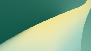
We settled on a combination of light and dark greens with brighter yellows to convey our new purpose and help us stand out.
Orbit design system
Of course we had to create a design system for the new visual identity and give it a name – we are designers after all! The Orbit’s imagery uses the arrows from the ‘beaks’ of the V and R from the logotype along with spheres and key lines to create different orbit animations.
Express ourselves
It feels exciting and liberating to have a new brand – yes we went through the pain in order to market ourselves more effectively but we feel like kids with a new lego set with our new visual identity. We look forward to building great things with it and also having some fun and we would love to know what you think so please tell us here.