Is the AI/UX of prompting failing users in SaaS design?
Design • September 25, 2025
We’re living through one of those rare turning points in technology and UX/UI design —Jakob Nielsen calls it “the first new UI paradigm in 60 years,” which is a grand way of saying: the way we interact with computers has changed, and there’s no going back.
The trouble with prompts
The beauty of this new paradigm is obvious as Nielsen demonstrates when he prompts Bing image creator to an image with “with a cowboy in a space suit under two red moons”—and out comes a result that would’ve taken an afternoon of painstaking work in Photoshop. The effort reduced from hundreds of clicks to a single ask.
But then the cracks appear. What if you know exactly what you want but can’t quite put it into words? What if you ask for “a brighter image” and get back something that looks like the sun exploded? There’s a gap between thought and expression—a gap Nielsen calls the “articulation barrier.” It’s like trying to describe a song stuck in your head to someone who’s never heard it.
It’s no accident that “prompt engineering” has become a sought after skill and that people are sharing ‘good prompts’ and basically saying ‘look at this, it actually did something good so copy me!’. That’s not a badge of honor for AI design; it’s a sign that too many people are being left behind.
Where prompts fall short
The weight of words
Half the population in countries like the U.S. and Germany are considered “low-literacy” by research standards. Even for those who are fluent, putting fuzzy ideas into precise prose is no small feat. It’s why software specs are so often a mess, why emails spiral into novels, why we groan at the blinking cursor. Prompts amplify this old problem instead of solving it.
Control, or the Illusion of It
Traditional interfaces give us dials, knobs, sliders—the tactile comfort of nudging a thing until it feels right. Prompts, by comparison, are a black box. You toss in a request and cross your fingers. It’s the tech equivalent of ordering a cocktail from a moody bartender who may or may not understand what “refreshing but not too sweet” means.
Cars make this painfully clear. Remember when dashboards had buttons you could press without taking your eyes off the road? Now it’s all touchscreens and menus within menus. A study found it took nearly five times longer to do something as simple as turning off lane assist in a touchscreen car versus one with old-fashioned knobs. That delay isn’t just annoying; it’s dangerous. The same applies to AI: sometimes we need instant, precise control—not a riddle.
Learning in the dark
Menus and toolbars may look boring, but they’re actually generous teachers. They show you what’s possible. Prompts, in contrast, ask you to already know—or guess. And since prompts don’t behave consistently across tools, what works in one place fails in another.
To their credit, many SaaS UX interfaces add example prompts and suggestions to guide users — a kind of scaffolding to ease the blank-box anxiety. But it’s still a half-measure; helpful, yes, though far from a true solution .
Losing the thread
AI conversations can lose track of context or if they don’t, the user might neither of which is ideal if you’ve already spent several minutes trying to complete an action. Traditional UIs shine at this—they show you where you are, what’s selected, what settings are active. Prompts, on the other hand, often feel like shouting into the void, hoping the system remembers what you said three steps ago.
Hybrid interfaces
The solution isn’t to throw prompts away. They’re powerful, expressive, and efficient at their best. But they need partners. Sliders, buttons, visual cues—those humble old tools—still have so much to give. The sweet spot is in blending them.
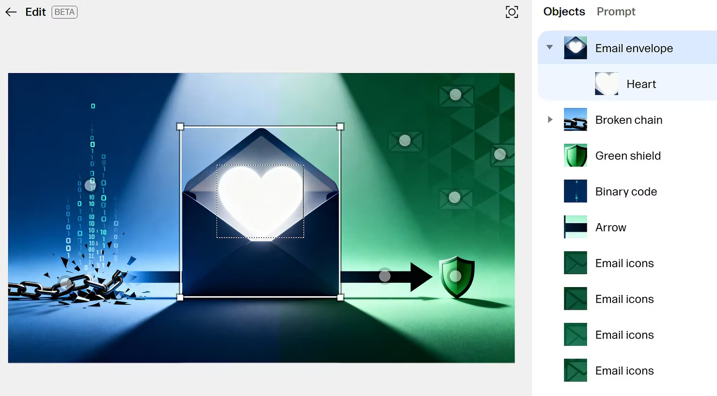
Some of the most exciting AI tools are already experimenting here. Image editors that let you circle a part of a photo and just say “make this bluer,” while the software handles the grunt work. Writing tools that don’t just leave you with a blank box, but offer scaffolding—templates, examples, suggestions—so you’re never starting from nothing.

In traditional UX design, affordances are everything — buttons, icons, even subtle shadows suggesting ‘click me.’ Prompts take those away, leaving users lost or frustrated unless they already know the magic words. It’s like asking people to play a game with invisible rules.
Dharmesh Shah calls this a “blended UI,” and it makes sense. High-level desires expressed in language, fine-tuning handled by touch.
AI UX principles to follow
A few truths are beginning to emerge:
- Match the medium to the message. Words are great for mood and direction. Hands are better for precision.
- Build on what already works. AI should slip into workflows, not bulldoze them.
- Show your cards. Transparency—what the system heard, what it’s doing—builds trust.
- Grow with the user. Start simple, open up complexity when people are ready.
For SaaS UX/UI, the challenge isn’t inventing new paradigms out of thin air — it’s knowing when to offer the comfort of a dropdown and when to let language take over. Hybrid design here isn’t just philosophy; it’s a practical way of getting users to engage with AI en masse.
What’s next for SaaS AI/UX
Prompts opened a new way of working with machines, but they’re only the beginning. The immediate future belongs to interfaces that combine the openness of language with the clarity of more traditional UX/UI — buttons, sliders, dropdowns, and visual feedback.
It’s not about choosing between old and new. It’s about weaving them together — making AI tools that feel less like slot machines and more like instruments. Tools you can learn, master, even improvise with.
Because in the end, the point isn’t to talk at machines. It’s to work with them. And that requires more than a prompt.
The future of AI UI isn’t some distant abstraction — it’s taking shape right now in SaaS dashboards, productivity tools, and the everyday apps we rely on. These are the proving grounds where hybrid UX patterns will either frustrate or empower. The encouraging part is this: we still have the chance to shape them. With thoughtful design, the next wave of AI interfaces can feel less like foreign machinery and more like trusted collaborators — ones that make our work lighter, our ideas sharper, and our creativity just a little more free.

