How onboarding can turn your SaaS free trial-ers into paying customers
Design • March 8, 2024
We look at how 3 common onboarding patterns can be used to engage and motivate your customers to pay for your SaaS product long term.
“Good onboarding can result in a 60% increase in conversion rate. ”
– Anton Kosolapov, Yalantis via Smashing Magazine
Your first time users can be a fickle bunch.
Sure, they’ve looked at the competition, liked your SaaS product and signed up for a free trial but to get them to become a long term paying customer isn’t straightforward. And, if they churn before they start paying, it can feel like a real kick in the teeth.
Life after sign-up
When you’re immersed in the day to day of running your SaaS business it can be easy to lose sight of how your customers really engage with your product.
You will have a range of analytics plugged in and multiple customer feedback channels but it’s hard to find time to analyse and interpret all the data. You will likely be focussing the majority of your efforts (and money) on acquisition.
Your marketing site therefore will create a fantastic first impression with a honed value proposition, striking brand and sharp copy – it will succinctly convey that your product is the best choice and one super smooth sign-up later, the customer is in; but this is when the hard work really begins.
Second impressions count
If customers leave within months then your marketing efforts will have been wasted. Onboarding should be more than just a warm welcome to your new customers; it’s your chance to show the value of your product (quickly) and to convince the free trial crowd to pay.
“User onboarding is a once in a user’s lifecycle experience that—when done well—shortens a user’s time to value. We refer to this moment of value as a user’s wow or aha moment—aha like, “Wow this is awesome!” Or “Aha! Now I get it!””
– Katryna Balboni, Appcues
It’s a bit of a cliche but the “Aha!” moment really matters. As users of a product we need to feel the satisfaction of knowing that we’ve found the solution to our problem. I need to see the value and, once I do, I am much more likely to pay for your product.
There are several ways onboarding can do this and we look at 3 effective strategies below.
‘Get started’ slides
Probably the most common onboarding pattern is the get started slides which should be the first thing your customer sees when they login to your product for the first time.
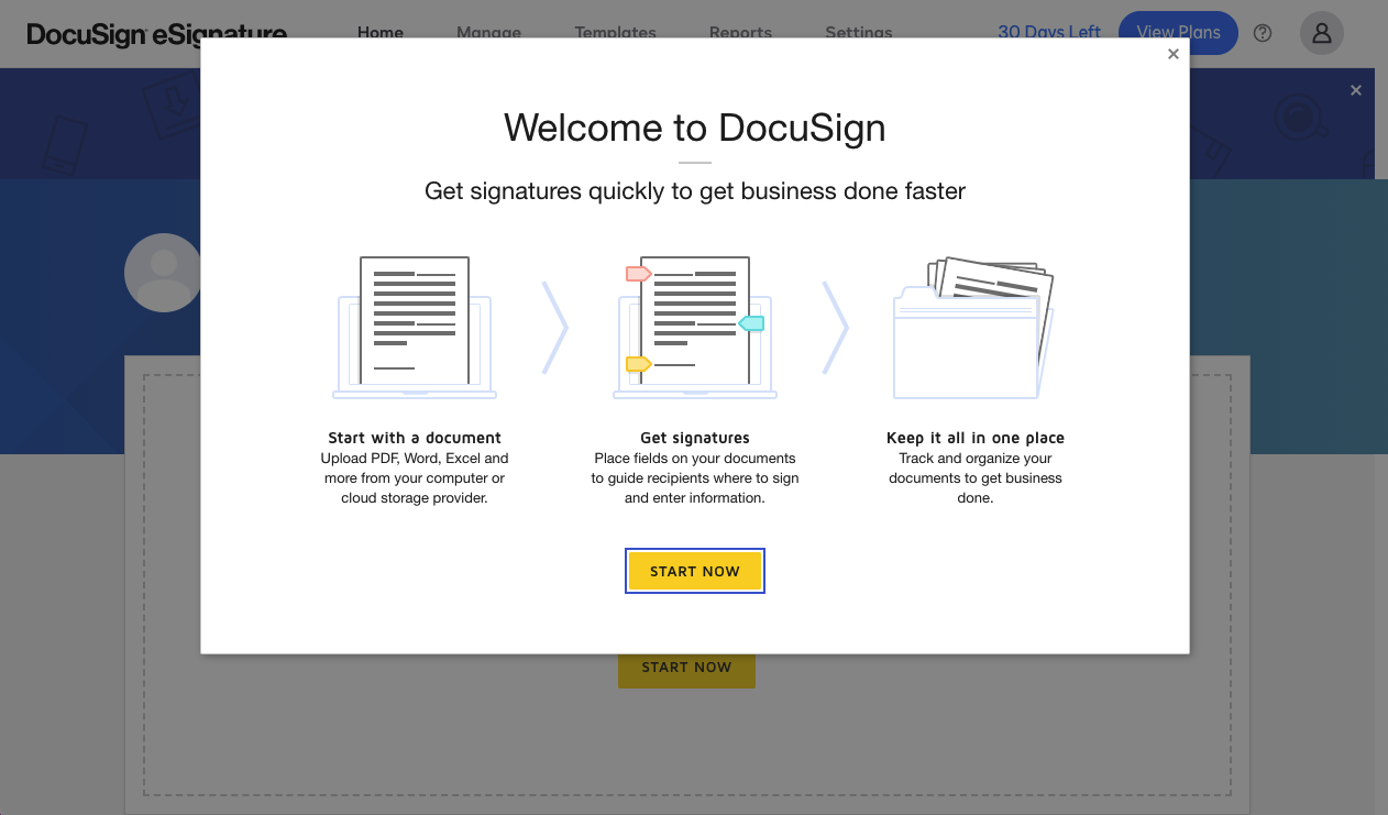
These provide a ‘soft landing’ for the newbie. Rather than being confronted with an empty dashboard or – even if populated – an interface which is alien to them, 3 to 5 slides can really help them get to grips with your product and not hit the sign-out button straight away (which I’ve done more than once – I’m sorry!).
Getting started screens can range from highlighting a few key features to enabling your engaged new user to complete key actions that will educate them about your product by demonstrating its core functions.
As well as a warm welcome message the slides should contain a summary of the key features of your product, using simple visuals and concise copy. They can also be used to harvest key information to enable the user to use the product and get them started on their journey. Hand holding is absolutely fine at this stage, you have an engaged customer, make the most of it!
Product tours
A good product interface should be easy to learn but, for a first time user, even an intuitive dashboard can be a daunting prospect.
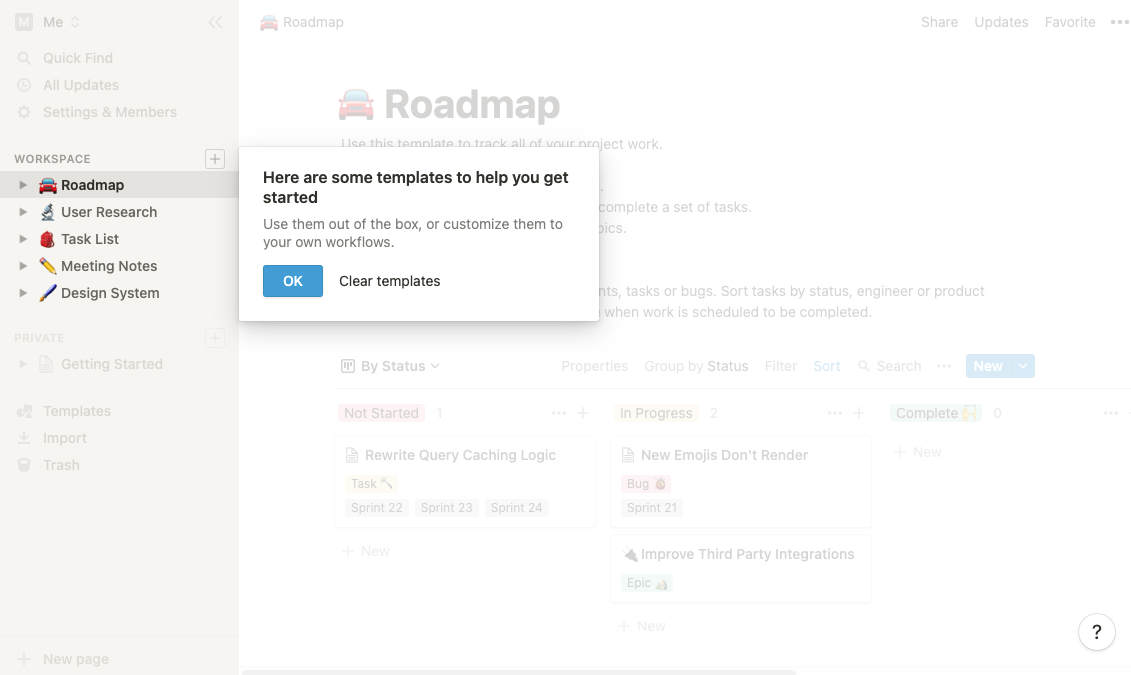
A product tour can be as simple as screenshots and arrows or, more effectively, can highlight areas of the actual product and provide a brief description of the feature and how to use it.
Users should be able to click through the tour at their own pace and provision should be made for them to return to it if they want to. Tours are great for product orientation but remember too many can be an annoyance so consider using a maximum of 5 with user controls to skip and close.
Checklists
To do lists or checklists tap into a very basic human need to complete or achieve. This form of ‘gamification’ provides a simple visual reward to your customer in the form of a ticked box or a progress bar indicating the % of the tasks they have completed.
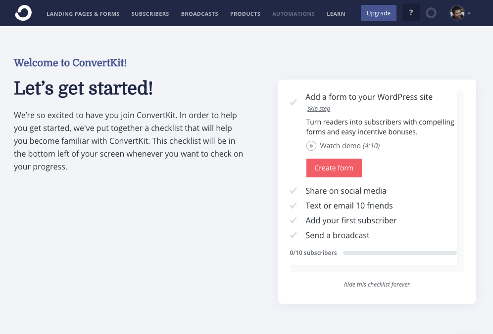
It’s simple but effective – I’ve found myself wanting to complete product to-do lists just because I love completing to-do lists! It’s a great way to get your customers using your product and providing some positive affirmations. Triggering positive emotions is a good way of building an emotional connection with your customers which then helps when they are making the all important decision to buy.
One size doesn’t fit all
So what’s the right onboarding approach for your product and customers?
This really depends on your product and customers! If your value proposition talks about simplicity then something like Toggl’s dashboard (below), which highlights the only 2 parts of the interface essential to the app’s core functionality, is a great way to reinforce that message.
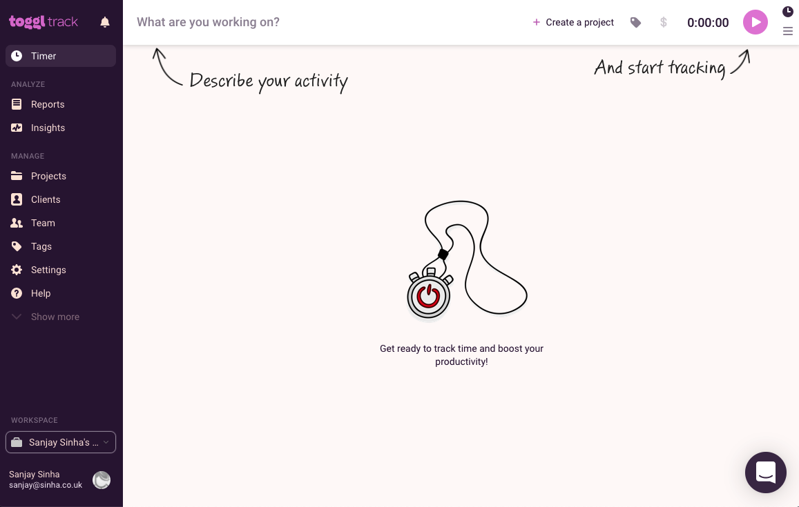
If yours is a multifaceted SaaS product that appeals to many different customer types, consider segmenting them during onboarding by asking requirements questions and demonstrating the best features based on users’ specific needs.
Optimise your onboarding
Onboarding is a vital part of the product experience and can accelerate your customers’ journey to ‘Aha’.
You probably already have some form of onboarding but have a look at the stats. Are users completing it? How long does it take them? Is there a relationship if they leave?
Some customer research through interviews and testing is well worth investing in, and using a combination of more than one onboarding pattern can help amplify the engagement. And don’t forget about your drip emails and push notifications of course!
Above all show them the value, whether it’s through a simple 3 slide clickable carousel or a segmented product walkthrough – ensuring your customer understands how your product will solve their needs will ensure they will stay and pay for it.
