Sign-up: Redesigning the most important customer journey
Project • May 11, 2019
Sign-up and onboarding are essential parts of the customer journey and require continuous monitoring and optimisation to ensure your precious customers are given the red carpet treatment when they sign-up for your product or service.
OK, so as a designer it’s not necessarily what you jump out of bed for in the morning but here at Vector we understand how vital these parts of the user journey are to the success of your product or service and love the challenge of making them as efficient and effective as possible.
For some digital products an email address and password are all that’s required to sign-up, as simple as it gets and what most apps must strive for when they design their sign-up journeys.
There are sectors and services where this simply isn’t possible though, where requirements of the service or legal regulation mean the minimum details sought are far more than simply basic login and contact details.
Financial services account sign-up
Investment management service Bestinvest’s ISA sign-up journey is one such case. System and FSA requirements mean there are several details a prospective customer must fill in for them to open a new account.
We’ve looked at best practice for forms in this blog previously and with the redesign of this key part of the customer journey, we were able to implement several of those recommendations.

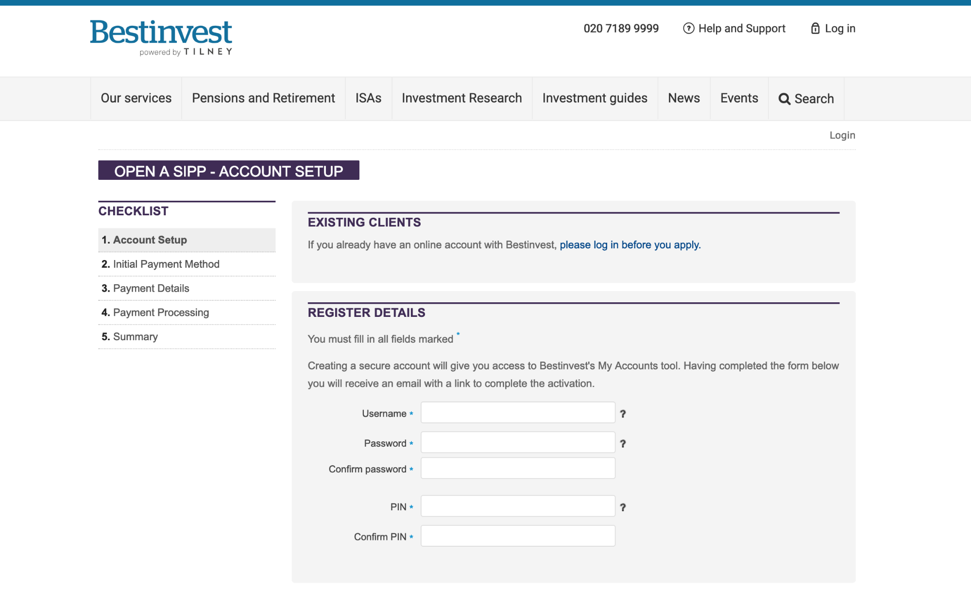
The Bestinvest account sign-up journey had been modified and added to since it’s launch over a decade ago but it was time for a full redesign – overhauling the user experience and rebuilding it from the ground up with the key business goals to reduce drop offs and increase sign-up completions.

Why
When we design a new user flow for a client we like to provide a UX rationale to explain our decisions and below is part of the explanation we provided to Bestinvest for the changes we made:
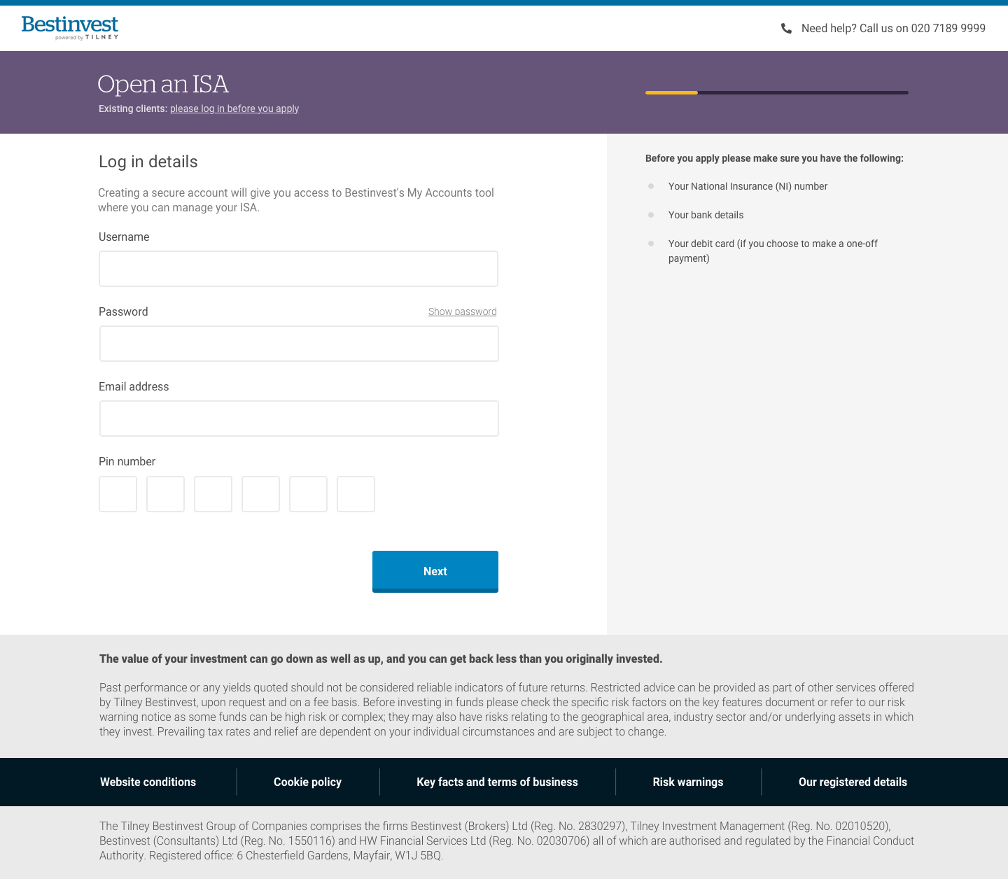
- Header ‘lite’ with no site navigation to enable the user to focus solely on completing the form. Key aspects of the new header are:
- Reduced height means the form sits higher up the page
- Smaller company logo as the customer probably doesn’t require such a prominent reminder of the company they are signing up with
- No site navigation to restrict distractions and ‘exit’ points after a potential customer has started the sign-up process
- Prominent phone number to provide reassurance and easy access to help if they need it
- Account type colour coding e.g. ISA is purple and SIPP is aquamarine to maintain continuity with the colour branded sections of the marketing site and outbound comms such as HTML emails
- Series of short steps rather than a single, long form page in order to:
- capture key login and contact details quickly on an initial screen to enable remarketing (subject to GDPR compliance) if user drops out
- Reduce ‘cognitive load’ where users feel overwhelmed by too many inputs on a single screen and abandons the process
- Single column form helps the user interpret fields without disruption. We’ve only placed fields next to each other when it makes intuitive sense to do so e.g. ‘First name’ and ‘Surname’
- Visual progress indicator was chosen rather than an explicit, text labelled stepped indicator as depending on the options selected, users may have differing journeys and the indicator gives a sense of where they are in the process without having to explicitly detail each step
- Buttons are used wherever possible over select inputs to help reduce clicks and speed up form completion e.g. choosing your title – Mr. Mrs. Ms etc. are buttons instead of a select input. Every click counts!
- Contextual form inputs are shown depending on the client’s choice i.e. if required, further information is requested depending on an answer to a particular question rather than showing it initially
The new journeys have only just launched and are being closely monitored but all the initial indicators are that this has been a significant improvement with less drop-offs and more successful completions. Try it for yourself – open an ISA with Bestinvest and experience the brand new sign-up journey.

